The Dashboard Is Green. Is the Workplace Safe?
A reassuring monthly report is a good thing. It's still worth knowing what's underneath it.
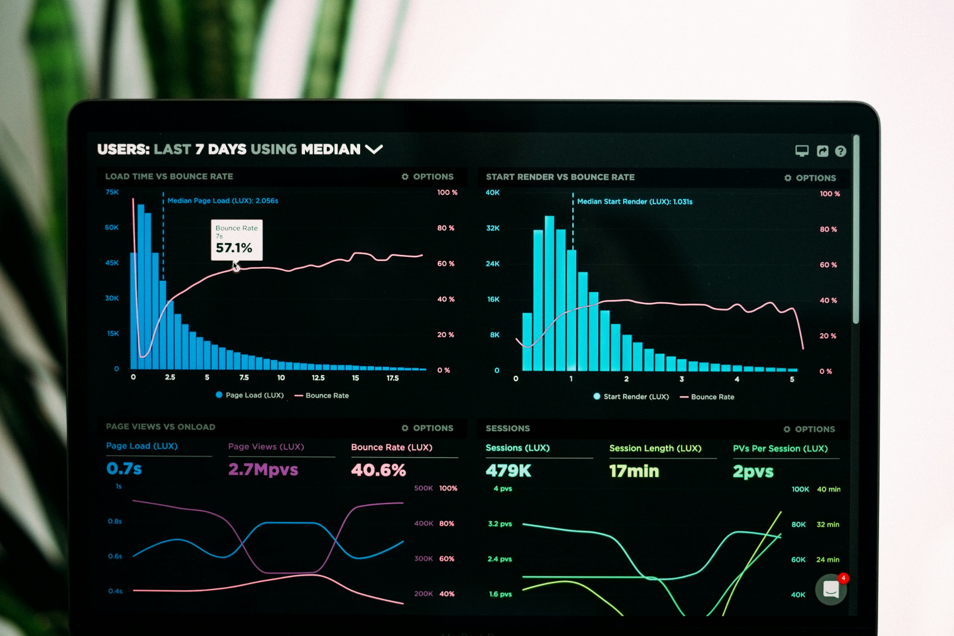
Picture the monthly management meeting. Recorded injuries are down. Training completion is high. Inspections are on schedule.
The safety slide is mostly green, there's a lot else on the agenda, and the meeting moves on.
Those results might reflect real progress, and if so, great. But before everyone relaxes, someone should ask one question: how do we know our biggest risks are actually under control right now?
A dashboard is very good at organising information. What it can't do is tell you whether you're measuring the right things, whether the data is reliable, or what it means. That part is still on us.
What is the number really telling you?
Take training completion. It tells you who finished the course. It doesn't tell you whether they understood it, or whether they can do the job safely on a bad day.
Inspection numbers show that inspections happened. You also want to know what they found, whether the serious findings are still open, and whether the fixes worked.
Even a low injury rate needs some context. It describes what was recorded over a particular period. It can't, by itself, prove that every important safeguard is doing its job.
HSE's approach to monitoring mixes planned workplace checks, maintenance, competency checks and incident investigation. That's a useful reminder: no single number does the work on its own.
Start with what could seriously hurt someone
The most useful leadership conversations about safety tend to start with the work, not the metrics. Where could someone be badly injured or made ill? What's stopping that from happening? Who checks it, and what happens when a check fails?
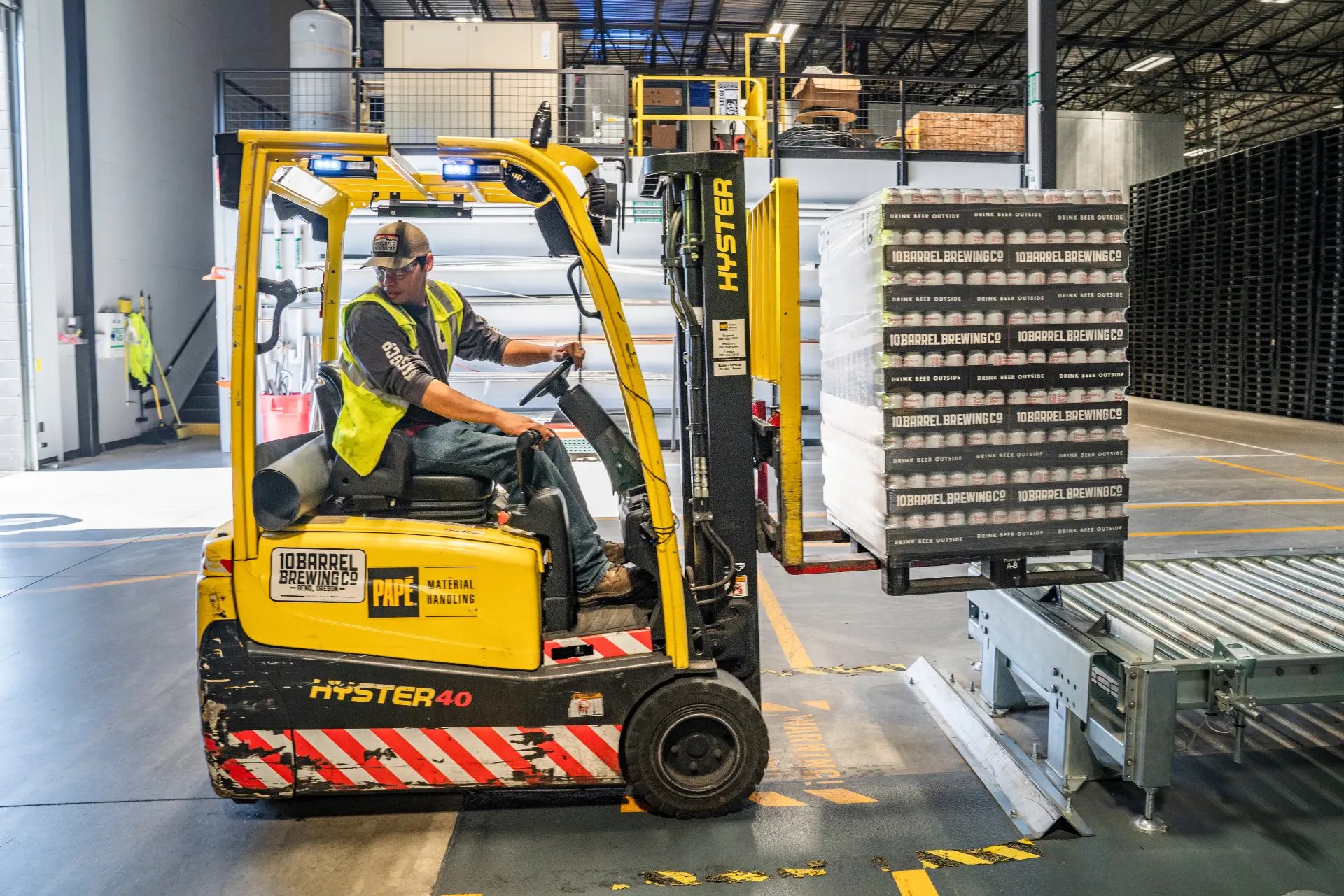
The answers look very different in a warehouse, a care home and a construction firm, and their dashboards should too. A warehouse leadership team might want to see evidence on pedestrian separation, vehicle movements and defects on equipment. A business handling hazardous substances will care more about exposure controls and whether they're being maintained.
The aim isn't a prettier report. It's measures that actually help people decide what to do next.

Read the exceptions
An overall completion rate can hide the one thing you most need to know. Ninety-nine closed actions don't cancel out one overdue repair to a critical safeguard.
So a good report puts the important exceptions front and centre: what could go wrong, what's protecting people in the meantime, who owns it and when it'll be sorted.
Then go and test the picture. Ask the people doing the work which problems keep coming back. Ask supervisors where the procedure gets hard to follow in practice. Sometimes their answers will back up the dashboard. Sometimes they'll tell you something it completely missed.
Next time the safety slide comes up green, try asking what gives you confidence your most important controls are working, which open issue deserves attention whatever the overall score says, and what the people on the floor have told you this month.
Green is a useful signal. Knowing how it was earned makes it a much stronger one.
Related reading: Health & Safety Metrics, Part 1: Incident Metrics.
SafetyQube's dashboards are built to show the exceptions, not just the averages. Book a free demo.